7 Design Mistakes Killing Your Link-in-Bio CTR (and How to Fix Them)
Most of you are playing house with your "link-in-bio" pages. You spent hours picking a background color and uploading a profile picture, yet your click-through rate (CTR) is hovering somewhere near absolute zero.
Here is the unfiltered truth: your link-in-bio isn’t a digital business card. It’s a sales funnel. If you treat it like a static "about me" page, you are flushing traffic: and potential revenue: down the toilet. Most "influencer" advice tells you to make it "pretty." I’m here to tell you to make it work.
At Daily-Ads, we see thousands of creators spinning their wheels because they’ve fallen for "recycled garbage" design trends that prioritize aesthetic over action. If you want to stop being a "content creator" and start being a business owner, you need to fix these seven conversion-killing mistakes immediately.
Mistake 1: The "Link Dump" (Decision Paralysis)
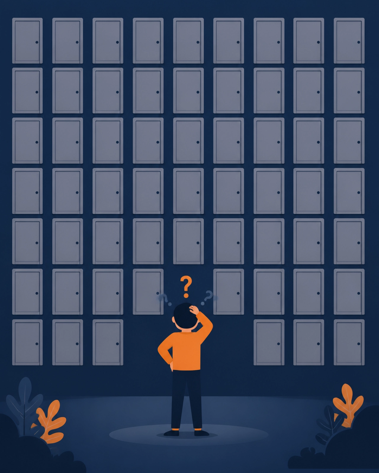
Stop trying to show off every single thing you’ve ever done since 2012. Adding 15+ links to your bio page doesn't make you look prolific; it makes you look desperate and disorganized.
The Reality Check:
Data across the industry is clear: pages with 3 to 7 links consistently outperform those with 10 or more. When you give a visitor 20 options, they choose the easiest one: leaving. This is "Decision Paralysis" in its purest form.
The Fix:
Execute a "link audit" today. If a link hasn't been clicked in the last 14 days, kill it. Aim for a maximum of 5 high-value destinations. Every extra link is a leak in your funnel.
Mistake 2: Vague "Label" Buttons (Death by Genericism)
If your buttons say "My Website," "YouTube," or "Shop," you have already lost. Those aren't Call-to-Actions (CTAs); they are labels. They provide zero incentive, zero urgency, and zero curiosity.
The Truth:
Users coming from a high-speed social feed need a reason to stop scrolling. "My Website" is a chore. "Get My Free 5-Step Marketing Blueprint" is a result.
The Execution Blueprint:
- Bad: My Store
- Good: Shop the Summer Drop (Live Now)
- Bad: Contact Me
- Good: Book Your 15-Minute Strategy Call
Mistake 3: Zero Visual Hierarchy (The Flatline Effect)
When every button is the same size, the same color, and the same font, you are telling the visitor that nothing is important. You are forcing them to do the work of deciding where to look first.
The Reality Matrix:
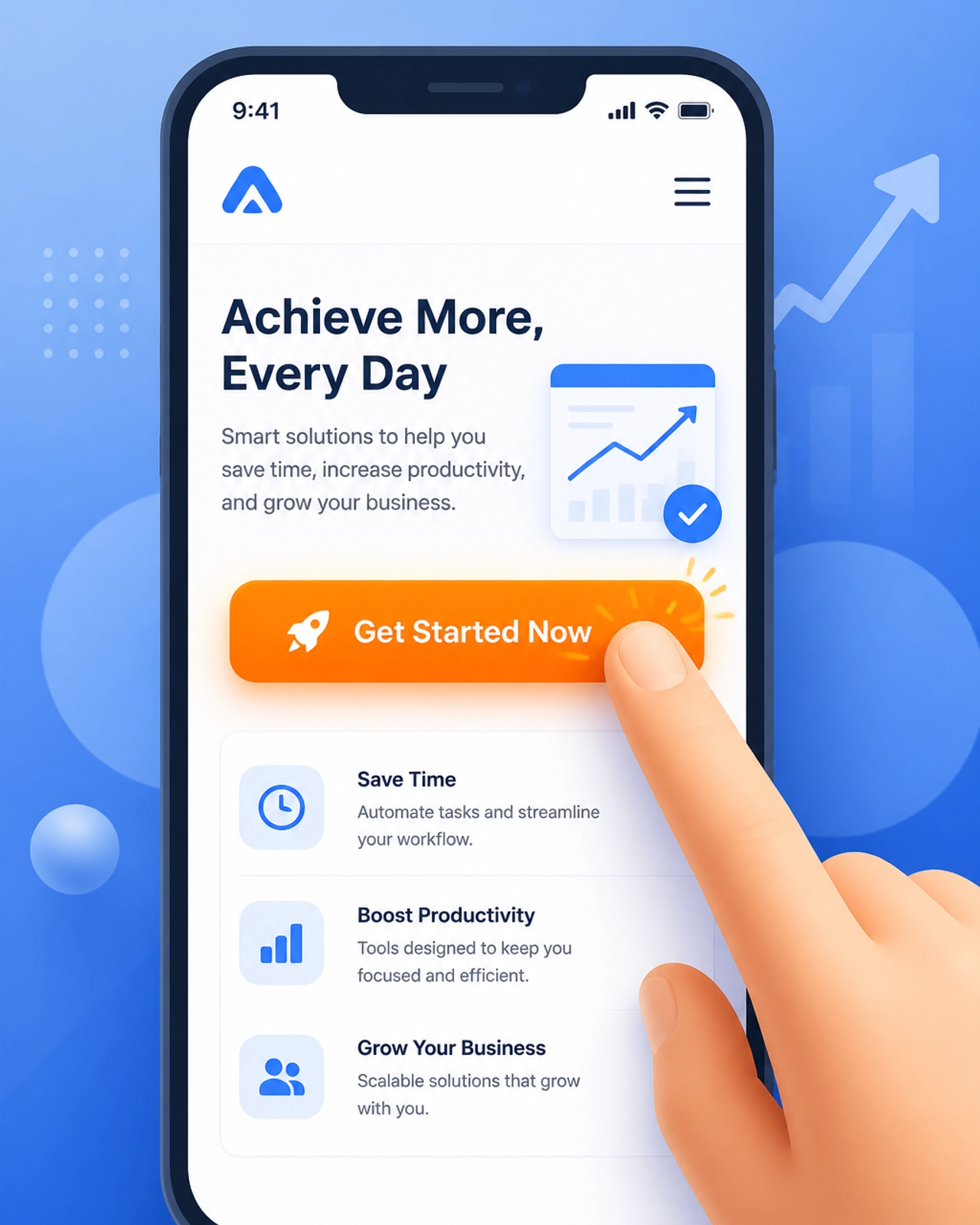
A high-converting Daily-Ads Linktree Page uses visual weight to guide the eye. Your most important link: the one that actually pays the bills: should be visually dominant.
The Fix:
Use a "featured" button style or a high-contrast color for your #1 goal. Everything else should be secondary. If your eyes don't immediately lock onto a specific button within 1.5 seconds, your hierarchy is broken.
Mistake 4: Ghost Links and Stale Content
There is nothing that kills trust faster than a "Limited Time Offer" button that leads to a 404 page or a promotion that ended three months ago. You are signaling to your audience that you are "asleep at the wheel."
Reality Check:
A broken link is a permanent exit point. Once a user hits a dead end, they are 80% less likely to ever click another link on your profile.
The Fix:
Set a recurring calendar alert to test every single link on your page once a week. If you are promoting a specific YouTube video or a seasonal sale, that link must be at the very top. When the relevance dies, the link dies.
Mistake 5: The "Desktop Bias" (Mobile Neglect)
You probably designed your link-in-bio on a 27-inch iMac. Your users are viewing it on a cracked iPhone screen while standing in line for coffee.
The Truth:
98% of your link-in-bio traffic is mobile. If your buttons are too small to tap, your text is microscopic, or your "fancy" background makes the page take 5 seconds to load, you are invisible.
The Execution Blueprint:
- Button Height: Minimum 44px to 60px (tappable area).
- Spacing: Avoid "fat-finger" errors by adding generous white space between buttons.
- Contrast: High-contrast text only. No "light gray on white" influencer nonsense.
Mistake 6: Branding Schizophrenia
Your Instagram or Twitter profile has a specific vibe. If someone clicks your link and lands on a page that looks like a generic template from 2005, the "scent" of the brand is broken.
The Reality Check:
Trust is the currency of the internet. Inconsistent branding triggers a subconscious "red flag" in the user’s mind. They might not know why they’re leaving, but they don’t feel "safe" enough to click.
The Fix:
Match your colors, fonts, and tone to your primary social channel. Use the same avatar. Ensure the transition from "Post" to "Link-in-Bio" feels like a single, seamless experience.
Mistake 7: Optimization Blindness (Ignoring the Data)
If you aren't checking your click-through rates weekly, you aren't a marketer; you're a hobbyist. Most people "set it and forget it," assuming that because the page is live, it's working.
The Truth:
Your first layout is a guess. Your tenth layout: backed by data: is a machine. You need to know which links are "dead weight" and which ones are your "power hitters."
The Execution Blueprint:
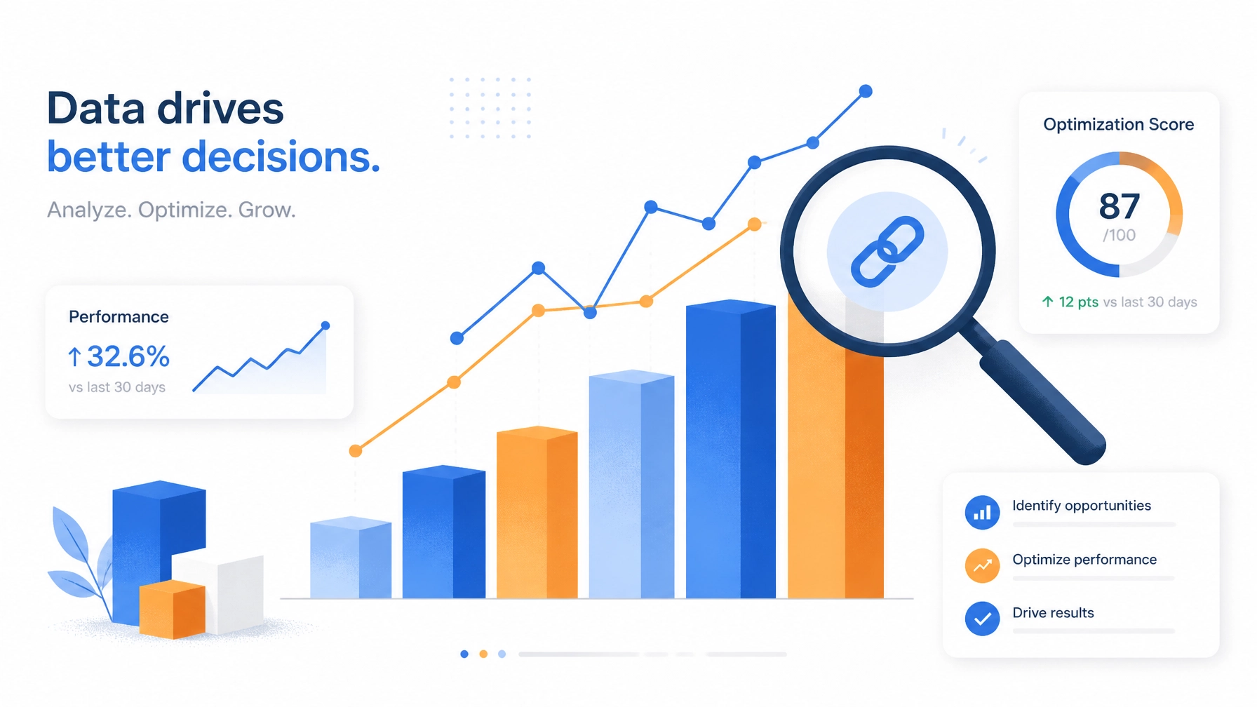
Stop guessing. Use the built-in analytics on the Daily-Ads platform to see exactly where the clicks are going. If a link is at the top but has a 0.2% CTR, move it to the bottom or rewrite the CTA. If a link at the bottom is getting all the love, promote it to the #1 spot.
The 90-Day Commitment
Building a high-converting link-in-bio isn't about a single "hack." it’s about discipline. Stop chasing "shiny objects" and focus on these fundamentals. Close the tabs of the gurus telling you that you need a 5-page personal website before you've even made your first $1,000 online.
You need a centralized hub that works as hard as you do. You need to stop wasting traffic and start capturing it.
Ready to stop playing house and start building a real marketing funnel?
Get Your Free Link-in-Bio Page Now